
The Story of
the Birnam Brand
The Birnam Hotel brand identity is a celebration of heritage, nature, and craftsmanship, shaped by the place we call home and the era in which the hotel first opened. From the outset, we wanted our visual identity to feel rooted and authentic, drawing quietly from the landscape, history, and creative traditions that surround us.
Developed by Kim at Rural Studio in collaboration with local artist and printmaker Lyndsey Davidson of The Hunter Press, the brand brings together traditional printing techniques, historic Scottish typography, and a colour palette inspired directly by our natural surroundings. It’s been a while in the making, but we hope we have created something long-lasting that reflects both place and process.
The Birnam Brand Mark
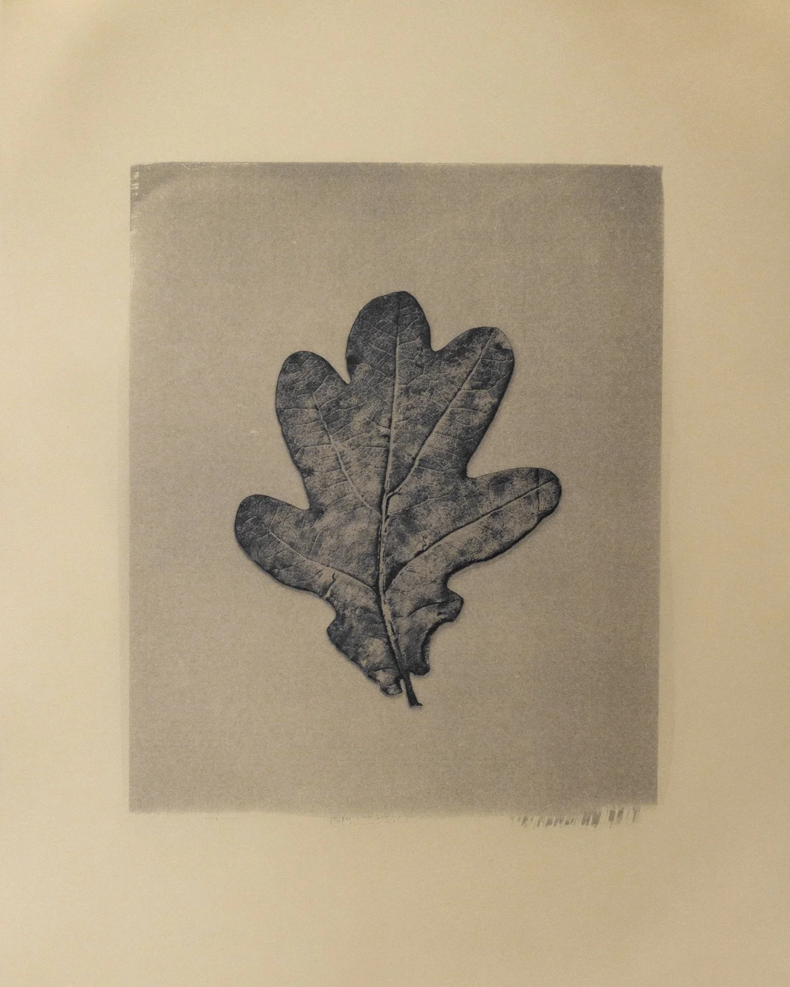
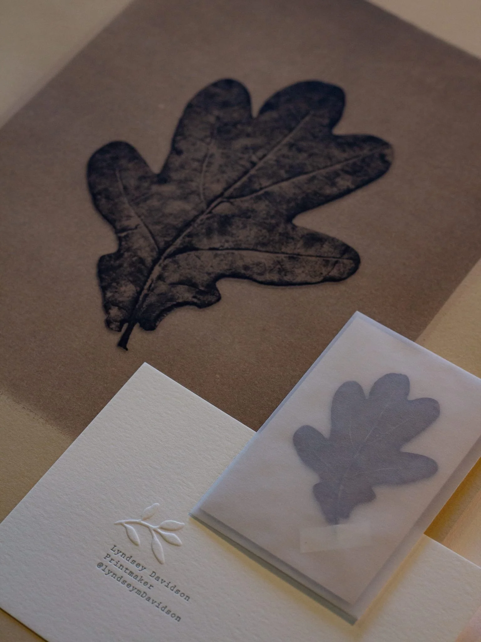
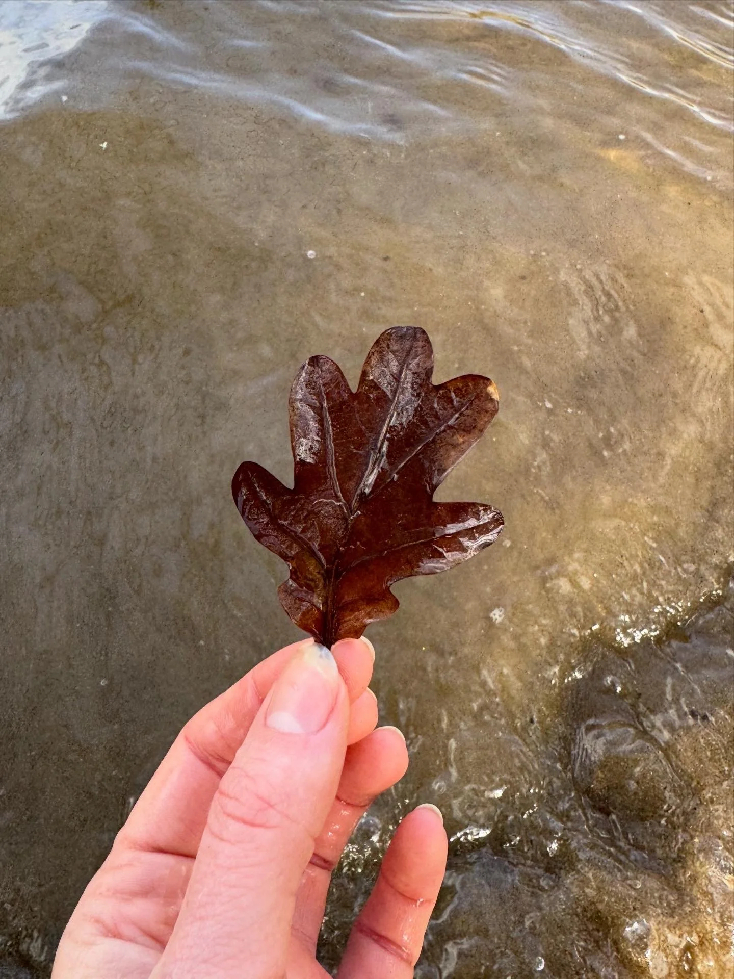
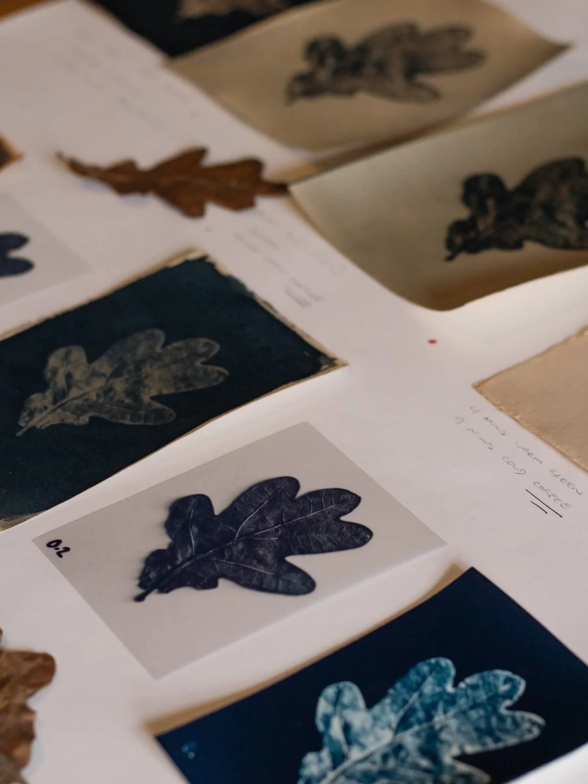
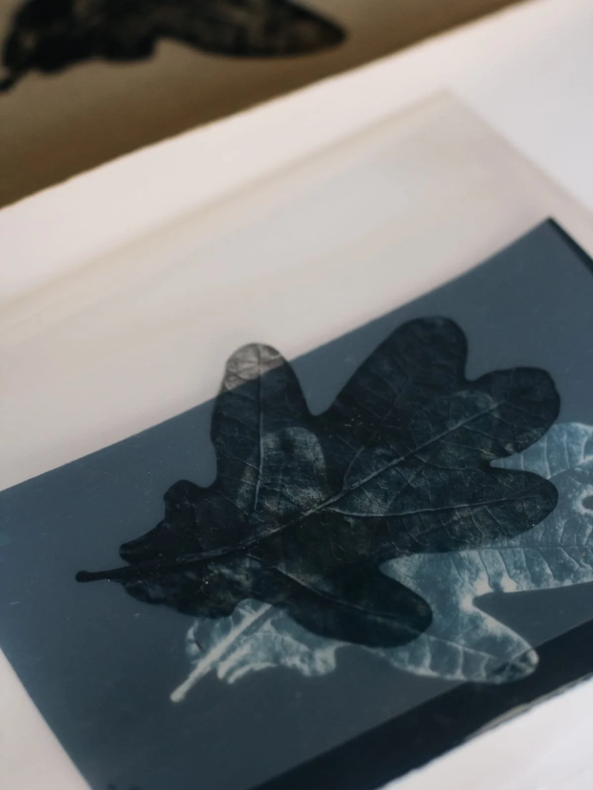
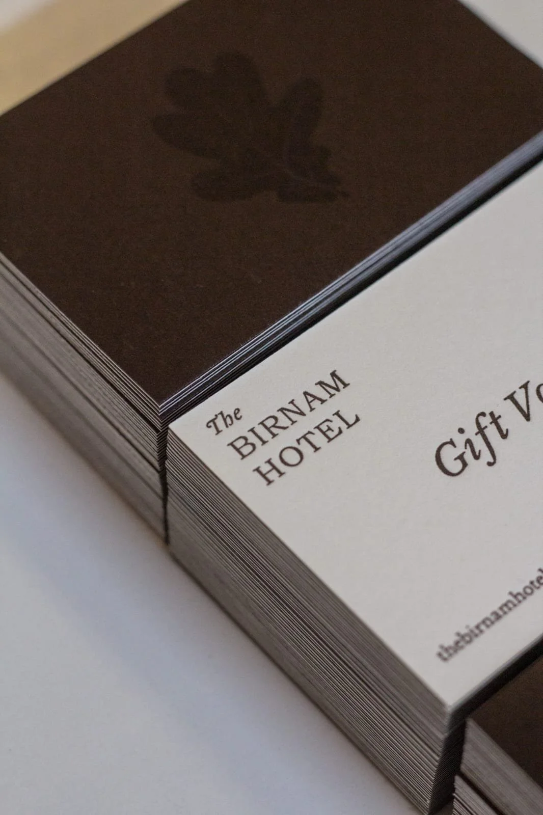
At the heart of the Birnam brand is a small but meaningful symbol: a single fallen leaf from the ancient Birnam Oak, standing just a short stroll from the hotel. Created in collaboration with Lyndsey, this little leaf will become a central part of our visual identity at the hotel — and you’ll be seeing much more of it as the project unfolds.
I (Kim) found this particular leaf beneath the oak and was immediately drawn to its simple, friendly form. It felt unpretentious and honest — much like what we hope the hotel itself will be. It has been a wee while since I last dabbled in cyanotype printing at art school, so discovering Lyndsey’s studio just down the road felt like perfect timing. Using the original leaf, Lyndsey created a beautifully toned print that will take pride of place in the hotel lobby. We’ve used a simplified version of the leaf’s form in the rest of our branding, and we’re excited to experiment with pattern, embroidery, metal casts and much more as the hotel continues to take shape.
Wordmark & Brand Fonts
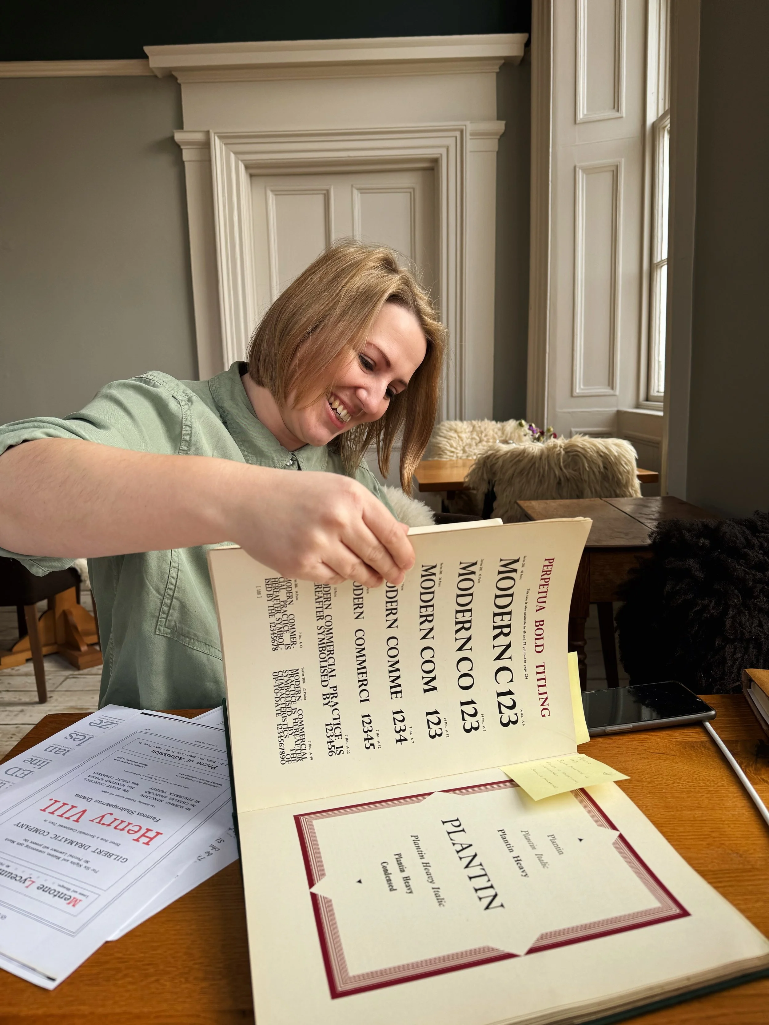
Choosing fonts might sound simple, but there are a lot of options out there! We knew we wanted our typography to feel timeless and characterful, with a subtle nod to the era in which the hotel first opened. Our search began at our local community archive, Historic Dunkeld, where Eric and I spent time poring over old hotel materials and local travel guides. We found inspiration everywhere: elegant serifs, bold headings, and even the handwriting on the backs of postcards sent from the hotel more than a century ago.
From there, Lyndsey and I began our search for the perfect typefaces. Lyndsey shared options from beautiful old letterpress books, and we both disappeared down rabbit holes researching historic Scottish type foundries.
In the end, we chose revived versions of historic typefaces originally cast in 1760 by renowned Scottish type founder Alexander Wilson, alongside type from the Miller & Richard foundry of Edinburgh. Wilson, also professor of astronomy, crafted his types with extraordinary care and enthusiasm. His letterforms were known for their excellent balance, and the vigour of his designs was unprecedented in mid-18th-century type design. Some of the earliest boldface types can be traced back to the Wilson foundry.
Our final wordmark blends tradition and refinement, drawing on the legacy of these two historic Scottish foundries. The serif letterforms, reminiscent of vintage Birnam Hotel ephemera, offer warmth, approachability, and excellent readability. These typefaces aren’t just beautiful; they carry the quiet authority of heritage, subtly reinforcing our identity as a place of story, craft, and welcome.
Colour Palette
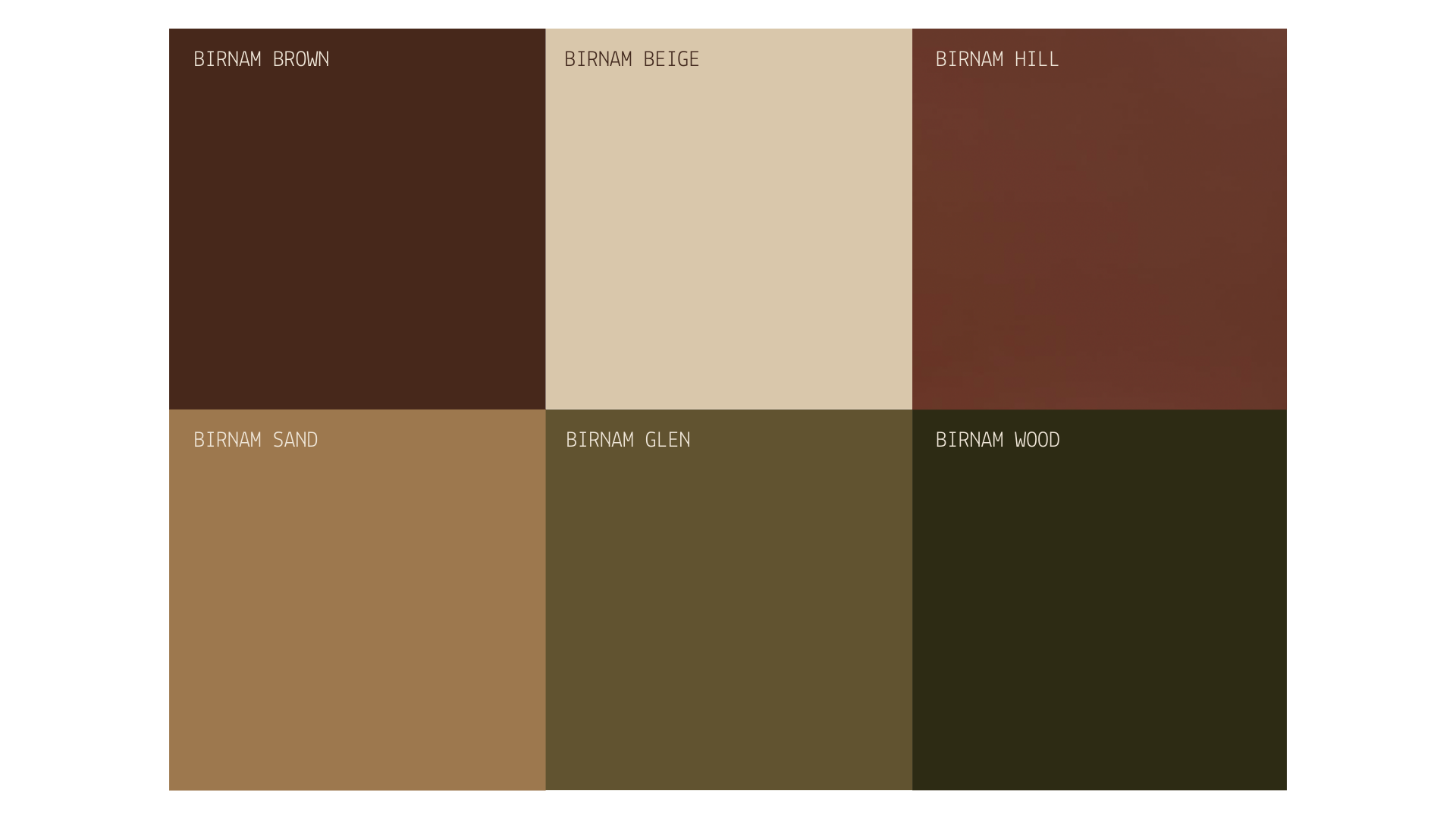
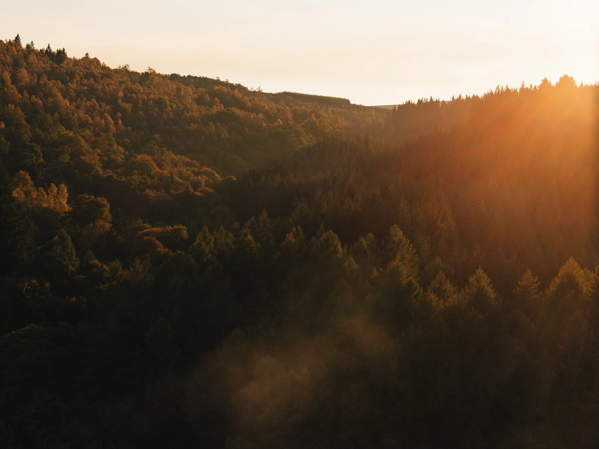
Our brand colour palette is drawn directly from the land around us here in Perthshire. Earthy greens reflect the mosses and foliage of Birnam Glen, while warm russet tones and deep pine greens echo the Scots pines and bracken that cover Birnam Hill. ‘Birnam Brown’ is inspired by the local clay unique to the area, helping to root the palette firmly in place. These richer shades are softened with pale, natural tones, taken from the sandy beaches along the nearby River Tay and local fieldstone. Together, the colours feel warm and tactile, familiar and lived-in, as though they’ve always belonged here.
We’ve already started using some of these colours in spaces around the hotel too, and seeing them on the walls has been one of those small but exciting moments where everything starts to feel real.
Illustration
We knew early on that we wanted to launch our website well before the hotel opened, to bring you along on the journey as the project takes shape. But with websites being such visual spaces, and no finished rooms to photograph just yet, it was always going to be a bit of a challenge.
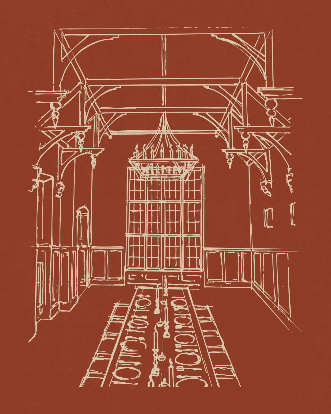
Illustration quickly became our way through that. Eric, who’s been designing the hotel alongside Kim and has a long career in fashion design, is also a beautiful drawer. We asked him to sketch some of the spaces we’d been dreaming up over the past year, and those drawings have helped the brand exist and breathe online long before the doors open. They offer small glimpses of what’s to come, while still leaving plenty of room for imagination.

Photography
We’re really looking forward to the next phase of the brand, when the spaces are finished and we can finally begin photographing and filming the hotel as it comes to life. The Birnam is a generous and impressive building, filled with beautiful natural light, and we’re excited to spend time capturing it properly.
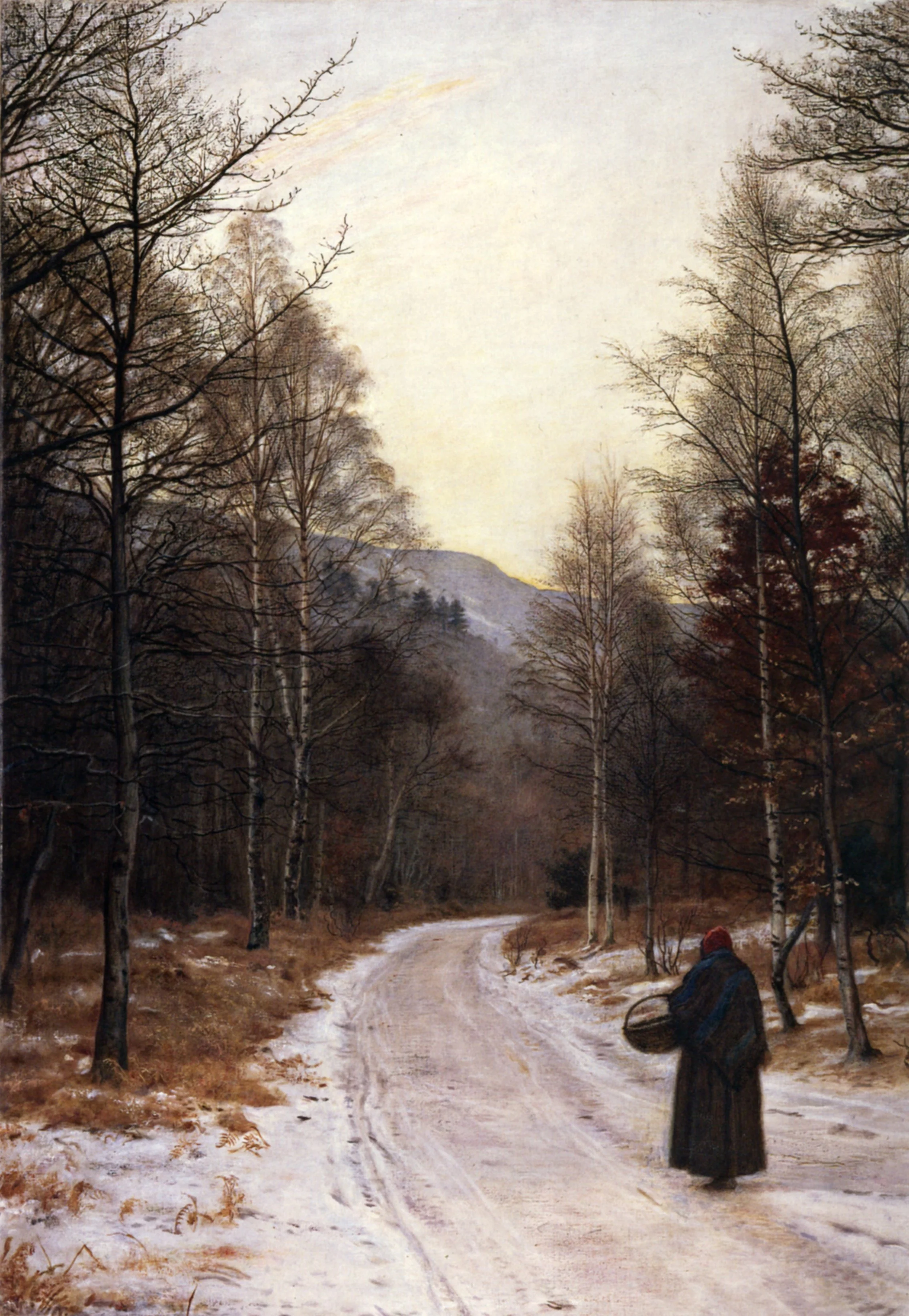
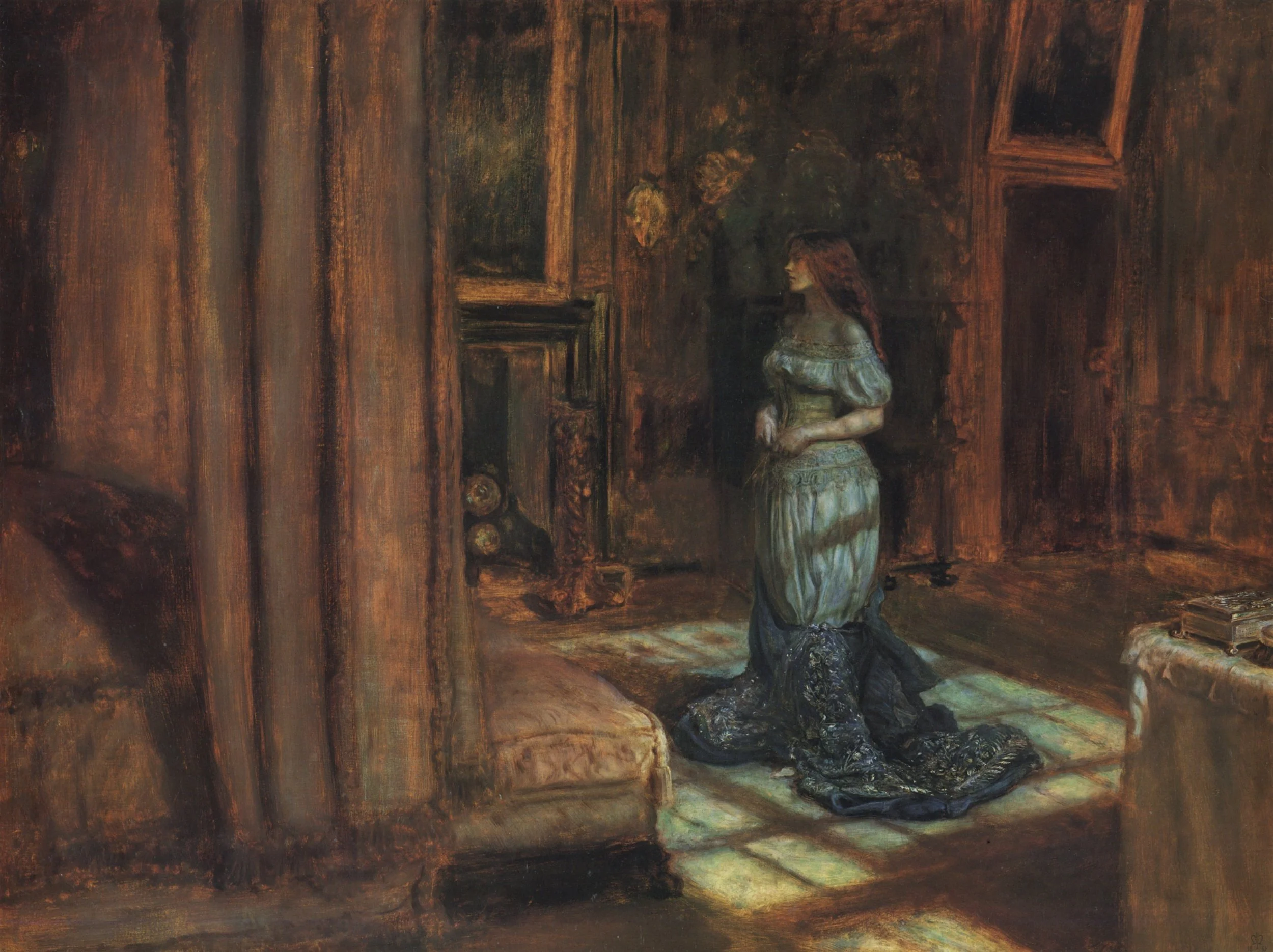
When the time comes, we’ll be aiming for imagery that feels atmospheric and cinematic, leaning into the rich, earthy colours and textures that run throughout the building. We’re taking inspiration from paintings created in and around this landscape, including works by Pre-Raphaelite master John Everett Millais, whose use of light, colour, and natural detail continues to influence how this place is seen and felt.
Our hope is to create photographs that feel considered rather than perfect, quietly evocative, and true to the character and warmth of the hotel.
We’ll be sharing more as the project continues to unfold. Thank you, as always, for following along and supporting the journey.
To receive more stories straight to your mailbox, subscribe to our newsletter below. You’ll be first to know our opening date, when bookings go live, and when event tickets and new stories from the hotel are released.